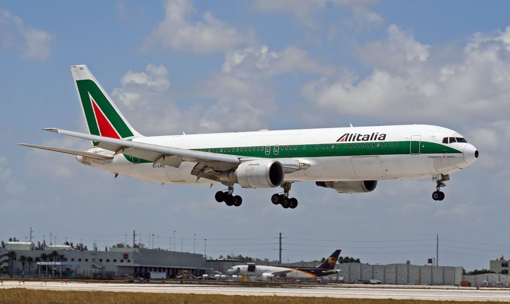
My eyes used to glisten over with childlike jubilee whenever I went to the airport (evidence above). My first flight was as an infant, and planes looked like this:

Fast forward about 30 years and the airport has now become a haven of panic-ridden anxiety. Will my TSA-approved shampoo bottle set off the airport bomb squad? Will my razor somehow target me as a well-shaven midwestern threat? Oh, how can someone so young (can I still claim this in my late 30s?) miss the old days of flying?
Interestingly, the corporate identity of the industry in the United States has taken a similar plunge.
If you look back almost thirty years ago, there were some incredibly beautiful airline identities. Saul Bass’s United Airlines identity still speaks truer to the virtues of an airline than any other. A Chicago boy, I remember being greeted with a blue, orange and red aircraft with “DC-10 Friendship” deftly written underneath the flight deck, warmly welcoming customers on-board.

The experience of flying on this airline mirrored the welcoming design identity. My father travelled so frequently that if he was seated in coach, the flight crew would present him with first-class meals because they knew him. This was a nod to his kindness, but also a reflection of the crew’s appreciation of his loyalty to the airline. Does this happen nowadays? (Hint: No.)
Further, you also had Bass’s beautiful “Continental’s meatball” (talk about color scheme) that proudly flew over the horizon (even amid a Frank Lorenzo-doomed legacy and a near death experience from bankruptcy).


There were also slick European carriers such as the Air France livery, and Alitalia proudly flew with Italian disorganization, yet impeccable style.
In 1992, Northwest Airlines unveiled one of the most daring yet successful re-brandings of an airline to date, with its bold color choices and use of simple serif typography:
This rebrand became the higher-echelon of branding efforts among the airline industry.
Shortly thereafter, United switched their identity to – how shall I say it best? – a 1990’s capitalist look that, while somewhat interesting, did not speak to the warm-hearted airline. The rebrand marked the end of promoting an enjoyable flying experience in lieu of corporate efficiency.
The airline industry in the U.S. underwent massive change after the tragic events of September 11th. Airlines have cut back on a number of passenger services; they no longer offer meals to their coach or sometimes even first class cabins, they charge for checked baggage, and there’s even a fee for boarding first on the aircraft. Long gone are the days of a dapper industry that catered to their clientele with class, and flew with pride on jumbo jets with lounges and piano bars.

Similarly, within the last decade, we’ve seen a real decline in livery and corporate identity design. Typography has been deserted and visual chaos dominates many identities out there today. I yearn for the days of simple, beautiful, and shall I say, awe-inducing airline identities.


